
Take Your Tastebuds on a Vacation
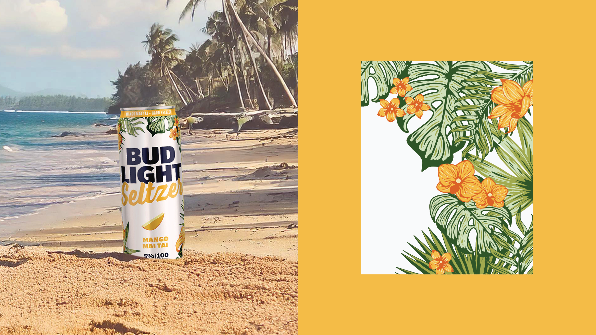
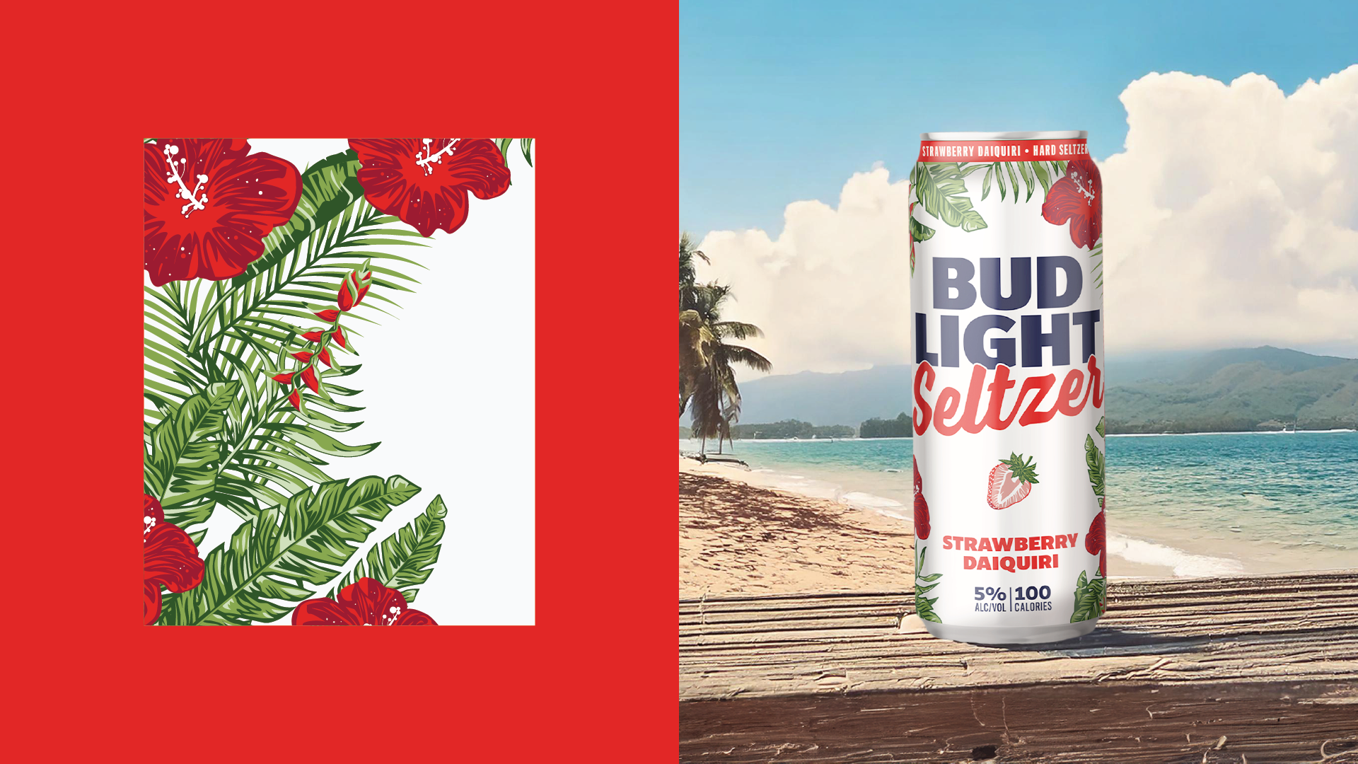
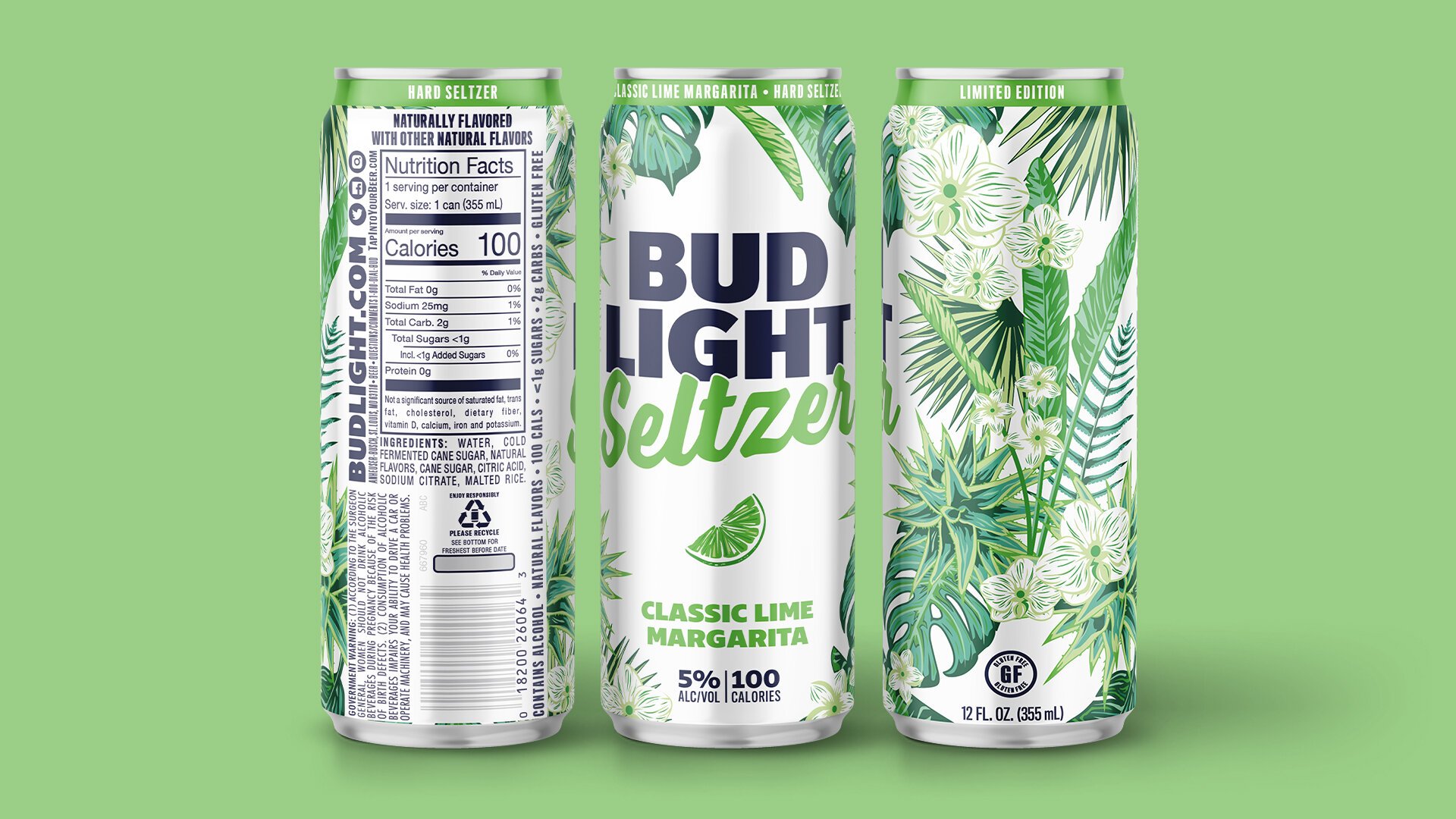
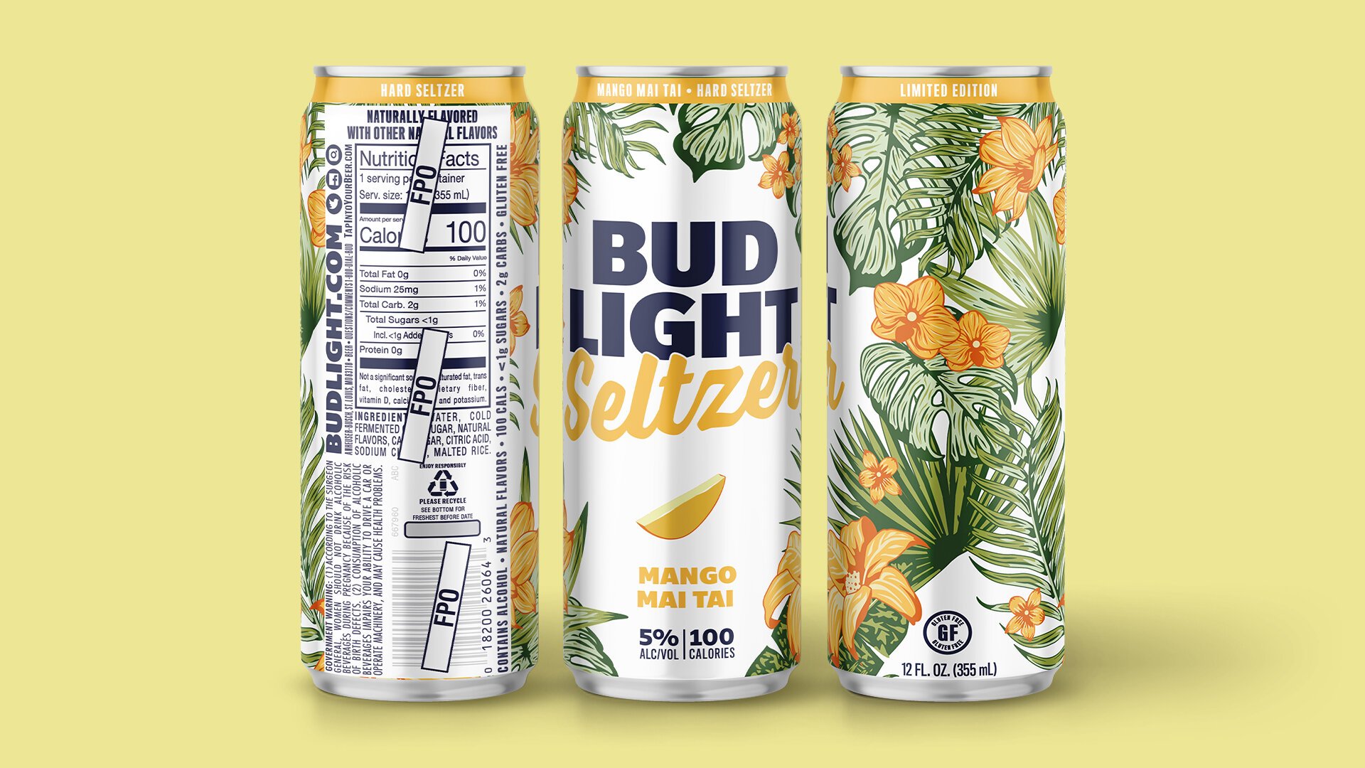
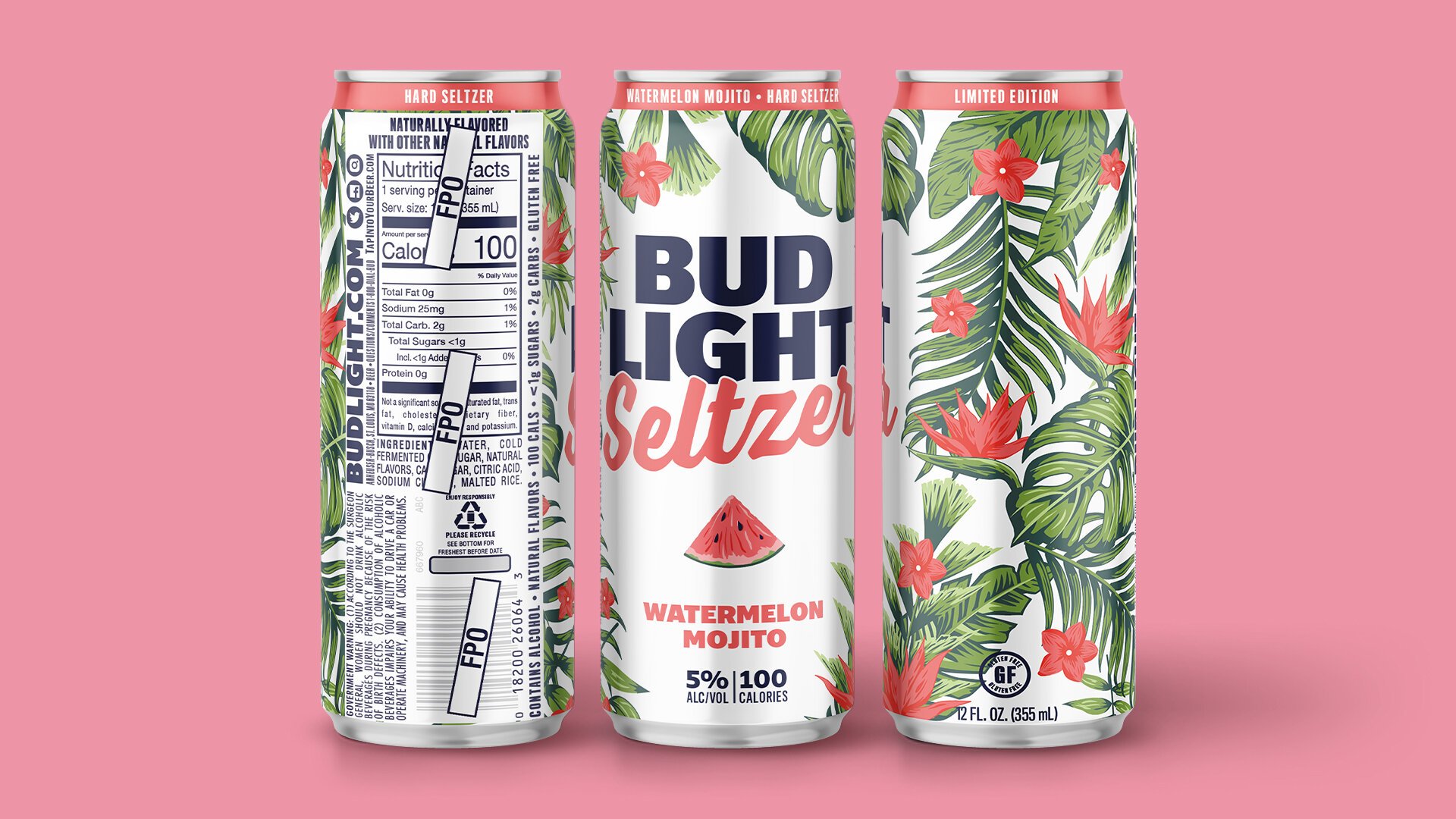
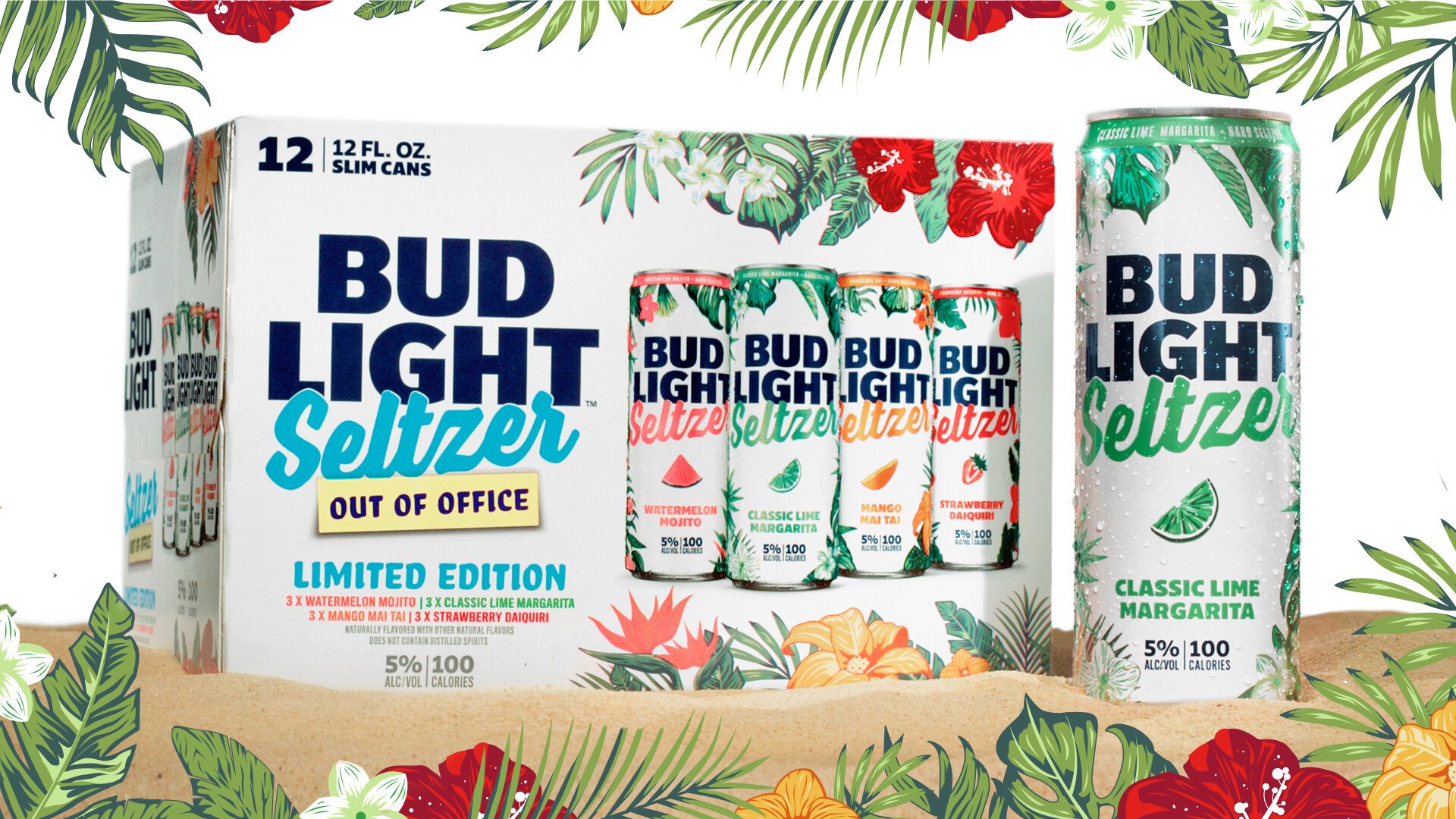
To help Bud Light Seltzer stand out in a saturated category, the Vivaldi team and I created a vibrant summer limited-time offering (LTO) designed to capture the spirit of tropical fun. We developed the full creative campaign and packaging system, from can designs to shipper boxes, using Hawaiian-inspired graphics and bold, fruit-forward visuals to highlight the variety pack’s refreshing flavors and seasonal appeal.
-
As the hard seltzer category reached its peak, Bud Light needed a way to stay relevant, competitive, and clearly differentiated from the wave of new entrants. The challenge was to create a summer LTO that reflected the light, refreshing nature of seltzer, often seen as a “better-for-you” alternative, while still resonating with Bud Light’s broad audience, particularly its male drinker base. The design needed to celebrate fun and flavor without leaning too sweet, too niche, or too gendered.
-
Our strategy tapped into the cultural shift toward “staycations” and casual, at-home getaways that became a growing trend among younger consumers. Targeting older Gen Z and younger Millennials, we aimed to meet consumers where they were: still craving the energy of vacation, but finding it closer to home. We developed a campaign and visual system that offered something both familiar and fresh, bridging classic summer cues with a more modern, energetic execution. The goal was to position the pack as a mini escape in a can, evoking the feeling of a beach day without needing a plane ticket.
-
Drawing from tropical themes and flavor-forward design, I created a series of Hawaiian-inspired floral prints and illustrations to bring the vacation narrative to life. The colors were intentionally bold, designed to reflect the vibrant flavors without skewing overly feminine. The system was adaptable across cans, variety packs, and campaign assets, creating a cohesive visual world that was unmistakably summer. Importantly, it retained Bud Light’s brand confidence and masculine edge while signaling flavor, refreshment, and fun.
BUD LIGHT
BRANDING
PACKAGING
GRAPHIC DESIGN
ILLUSTRATION
2019–2021


A Seltzer to Fall in Love With
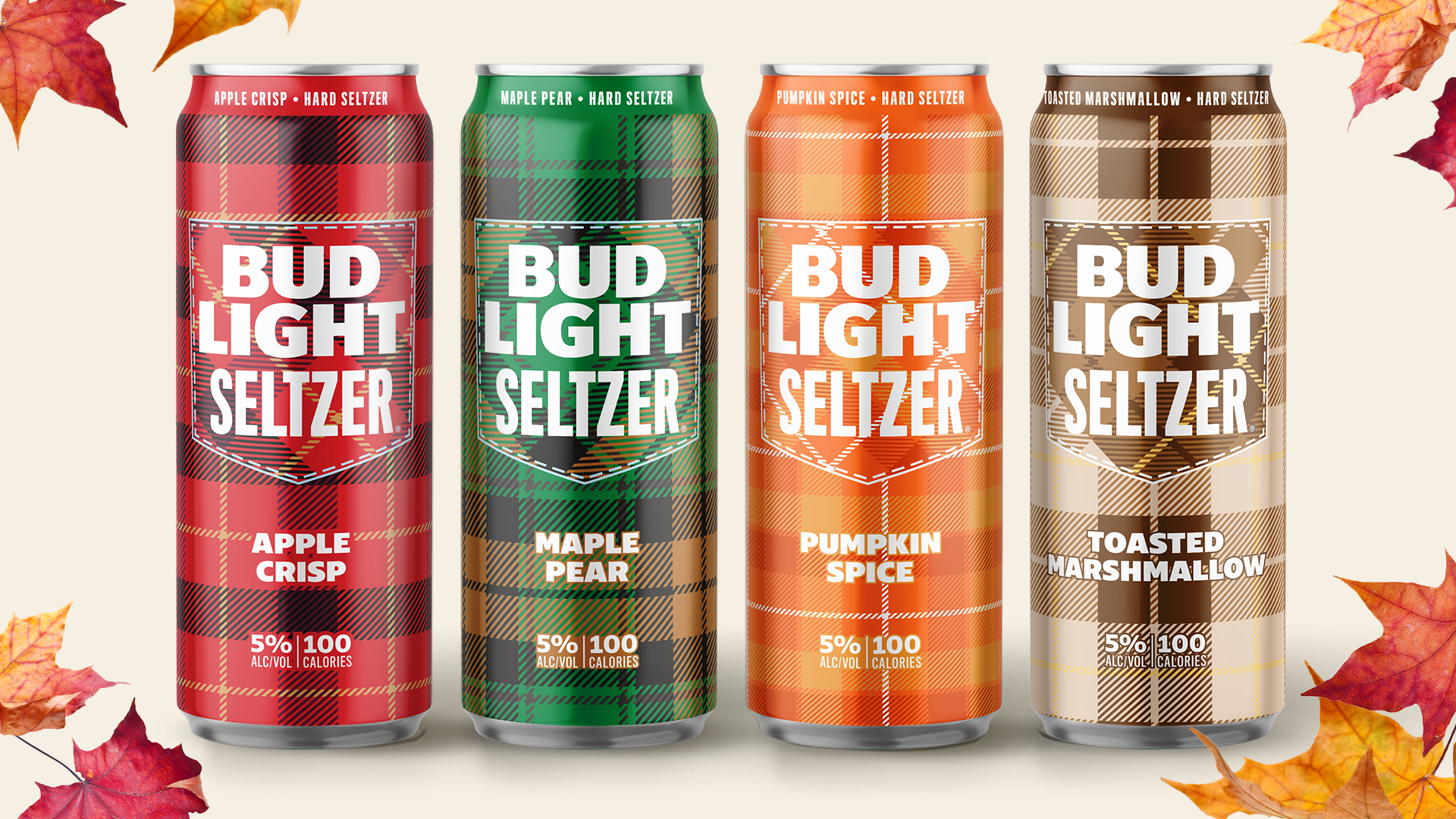
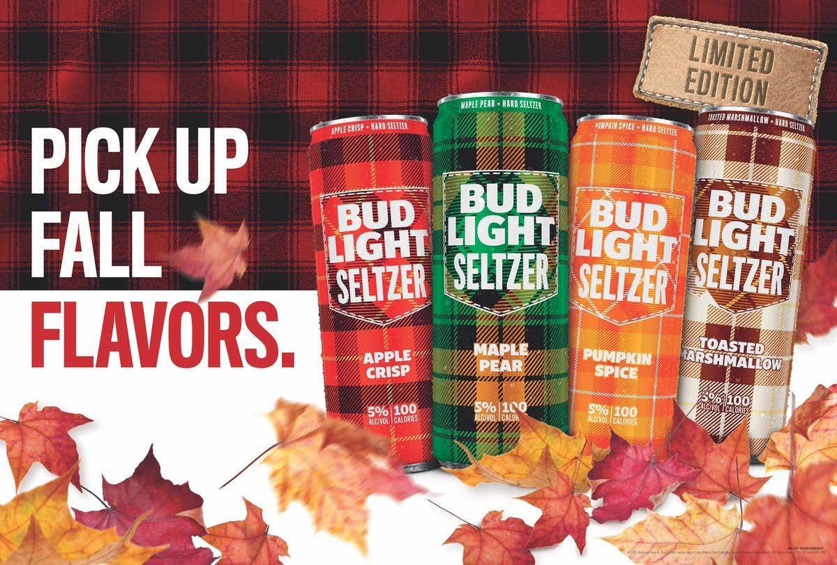
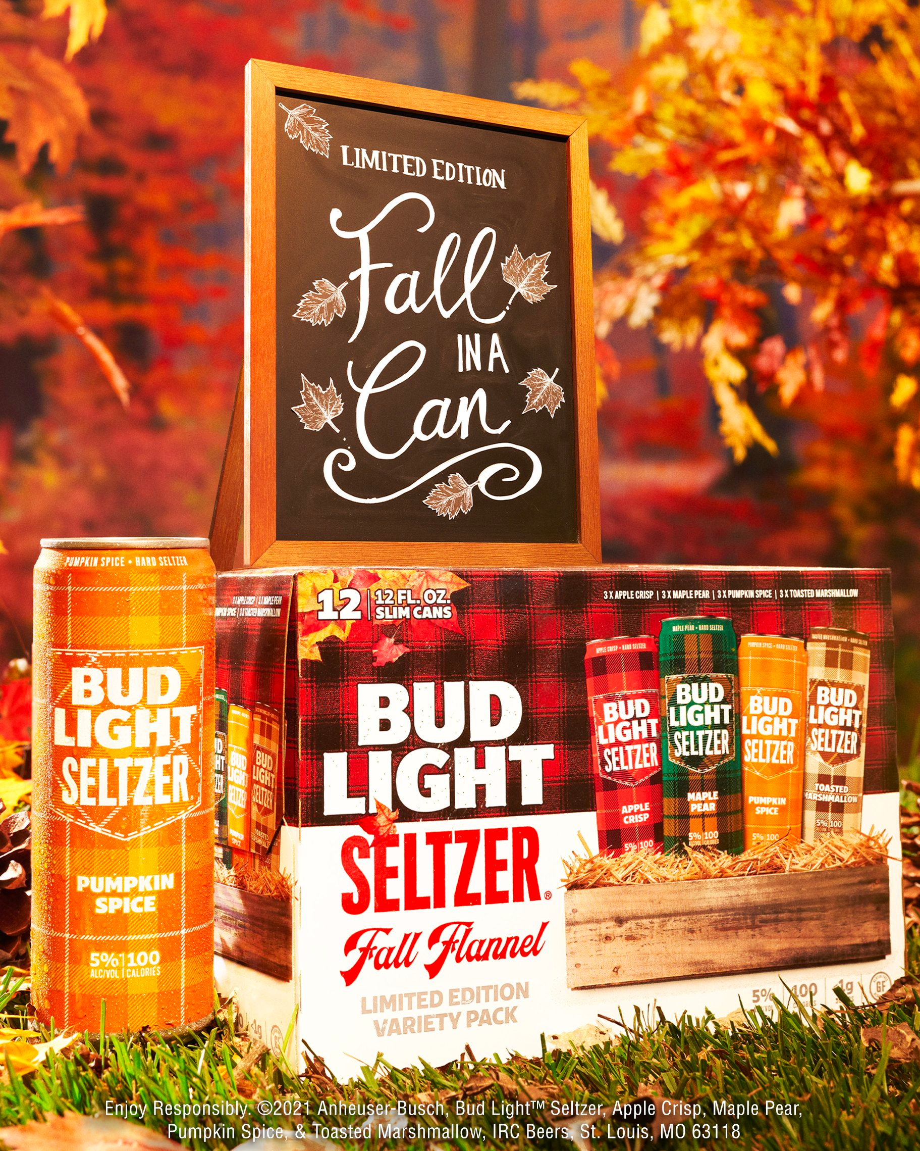
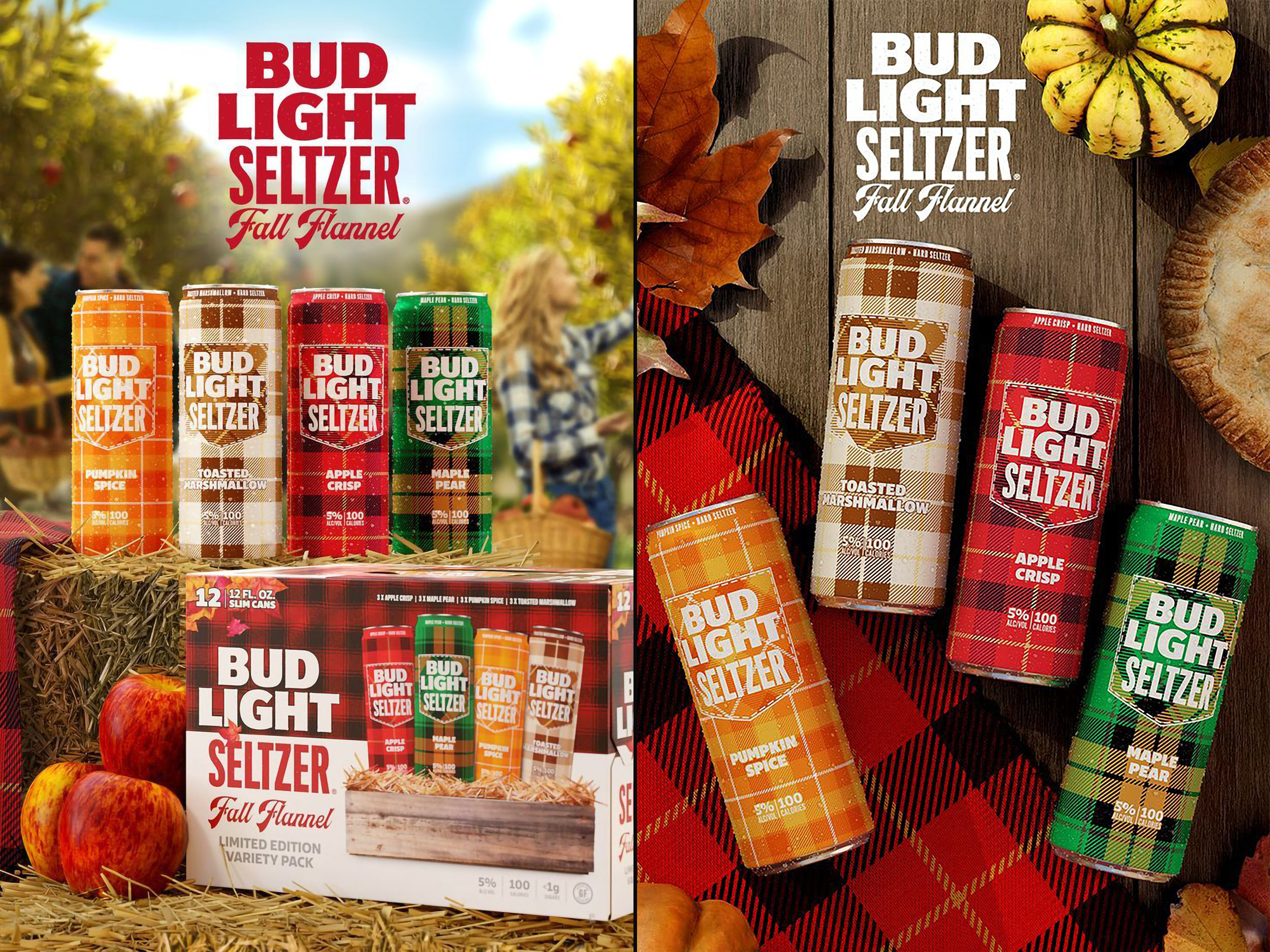
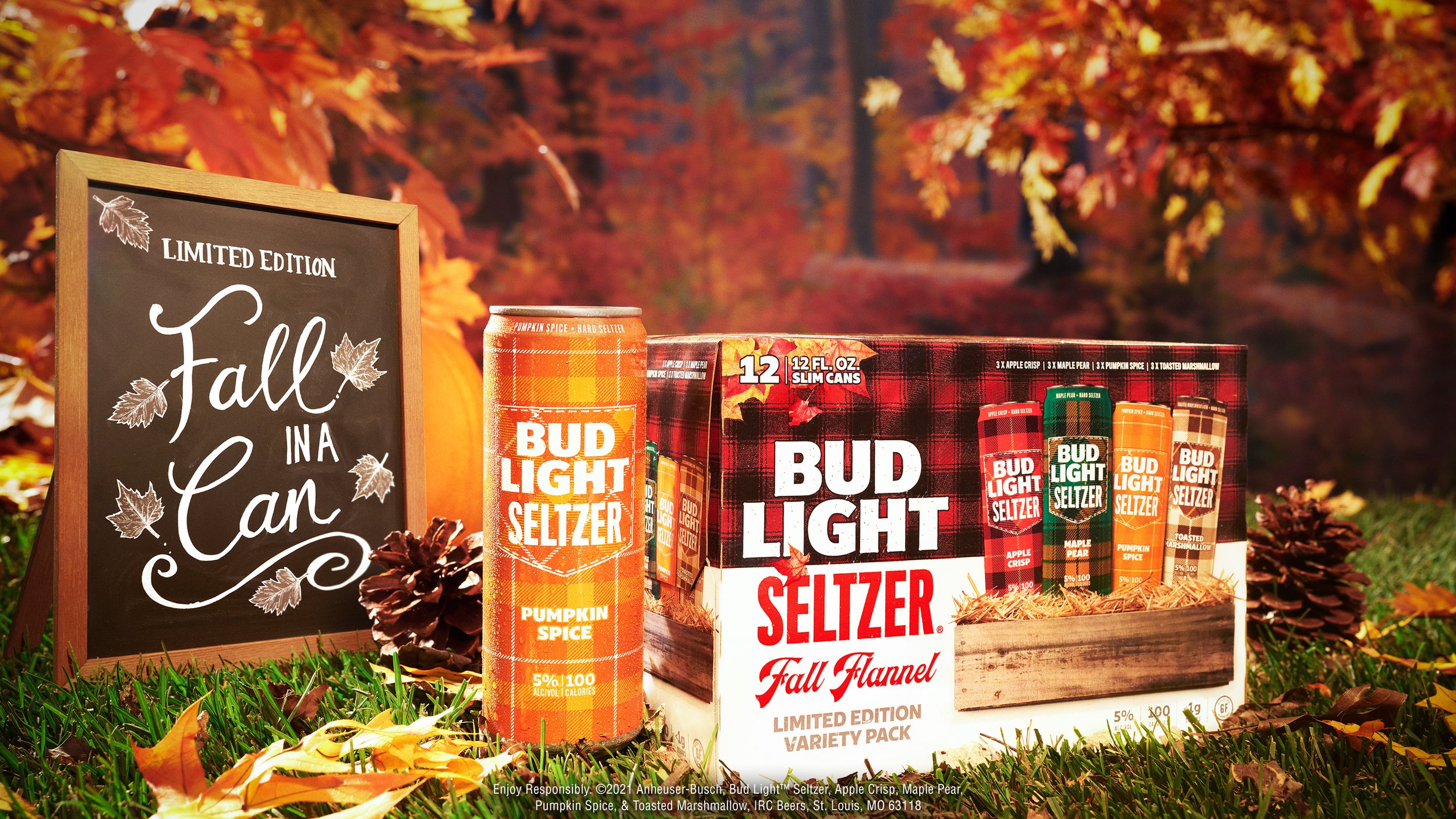
After the success of Bud Light Seltzer’s “Out of Office” LTO, the Vivaldi team and I developed a fall-inspired follow-up that leaned unapologetically into seasonal flavor and fashion. Bud Light Seltzer Fall Flannel was created to tap into the cultural love affair with all things autumn, from pumpkin spice to flannel shirts, delivering a seltzer variety pack that felt like a must-have piece of your Fall Starter Kit.
-
Hard seltzers are traditionally seen as summer drinks: light, fruity, and often paired with warm-weather occasions. Our challenge was to shift that perception and establish Bud Light Seltzer as a drink that belongs just as much in crisp, cozy fall moments as it does on a beach. We had to reframe seltzer's role in seasonal consumption while also maintaining brand relevance, especially among younger consumers who associate fall with a highly specific, culturally shared aesthetic.
-
To reposition seltzer for fall, we leaned directly into the cultural phenomenon of being “basic”, but in a self-aware, celebratory way. Our target? The unapologetic fall enthusiasts: flannel-wearing, pumpkin-spice-loving, apple-picking Gen Z and Millennial consumers who fully embrace the season. By framing the LTO as a key element of someone’s “Fall Starter Kit,” we tied the product to behaviors and symbols already ingrained in pop culture, ensuring it felt timely, relevant, and irresistible to our audience.
-
Inspired by classic flannel patterns and cozy autumn layers, I created a packaging system that quite literally dressed the cans for the season. Each flavor featured a custom flannel pattern that reflected the warmth and character of the drink inside, from Pumpkin Spice to Apple Crisp. The visual identity was playful, pattern-driven, and designed to look right at home in a fall picnic, Instagram post, or seasonal beer aisle. The cans became a part of the aesthetic, an accessory as much as a beverage.
BUD LIGHT
BRANDING
PACKAGING
GRAPHIC DESIGN
ILLUSTRATION
2021
Outcomes & Reflection
Bud Light Seltzer Fall Flannel became an instant seasonal favorite, reinforcing Bud Light’s role as an innovator in the space. It helped expand the seltzer occasion beyond summer and deepened emotional connections with a culturally aware, trend-driven audience. The pack not only drove excitement during a competitive time of year, but also contributed to Bud Light gaining 14% market share in the seltzer category. It proved that leaning into culture, boldly and playfully, can turn a seasonal stereotype into a brand strength.